There's a version of email design that looks impressive in a portfolio review. Clean layout, nice imagery, strong branding. And then there's a version that actually makes people click and buy.
They're not always the same thing.
After designing hundreds of ecom emails across dozens of agency partners and brands — welcome flows, abandoned carts, seasonal campaigns, win-backs — we've developed a clear picture of what separates emails that perform from emails that just look good.
Here's how we think about it.
Performance beats pretty. Every time.
The single most important shift in how we approach email design is this: every decision serves the conversion, not the aesthetic.
That doesn't mean ugly emails convert better. It means the design exists to guide the reader toward one action — not to showcase design talent, fill space, or impress in a Figma file review.
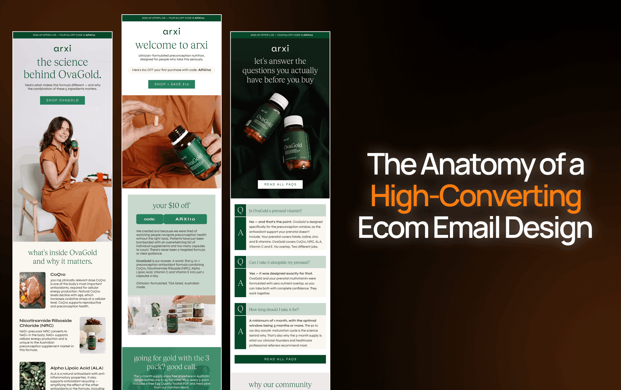
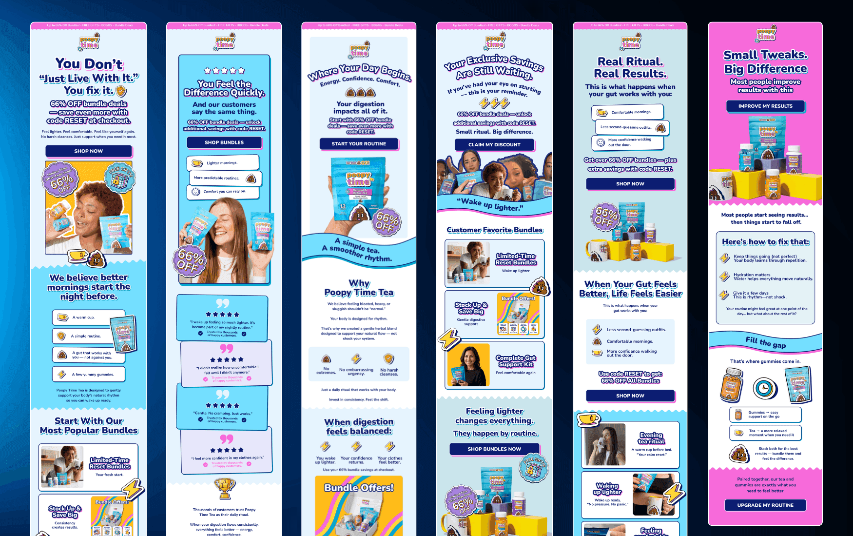
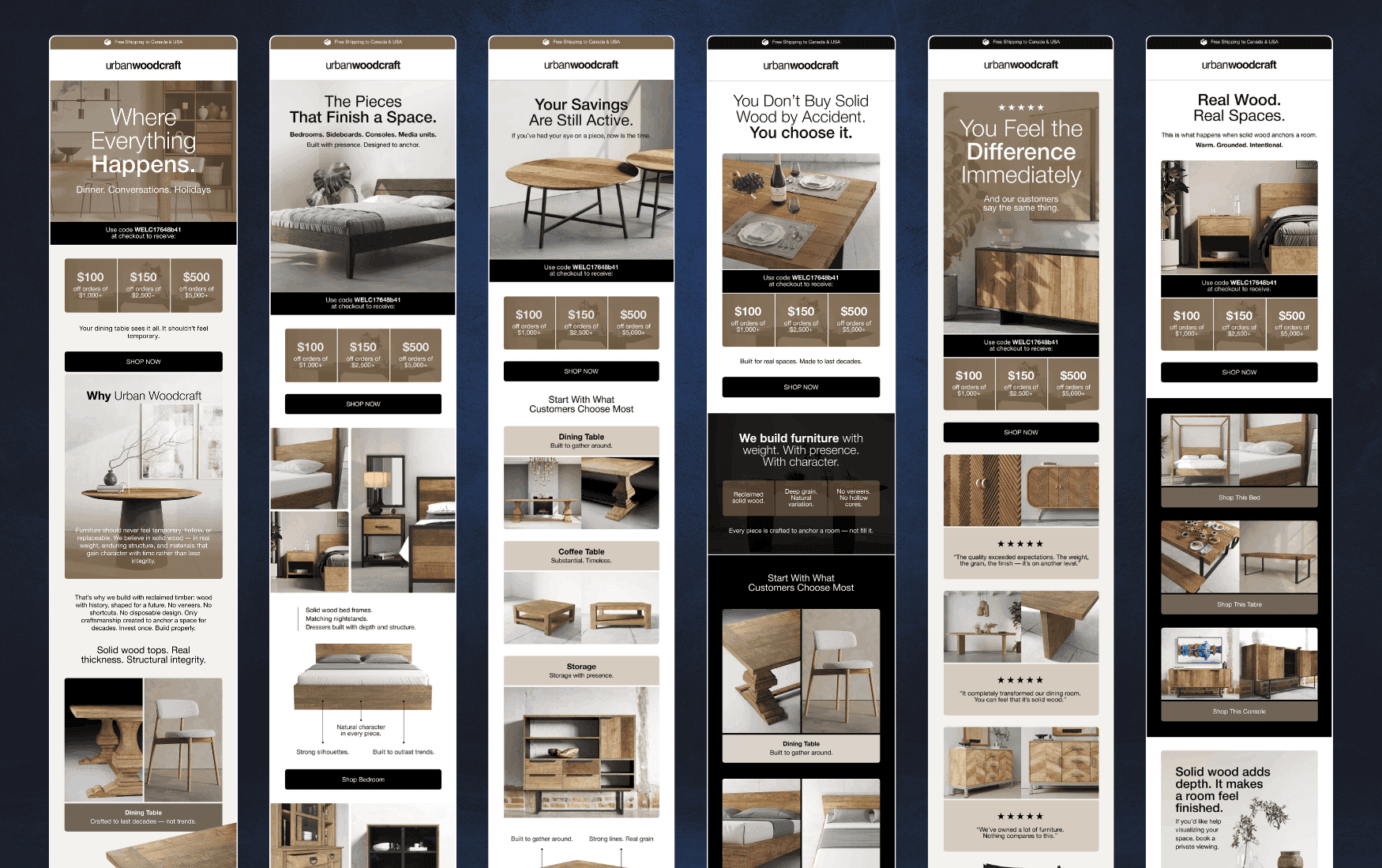
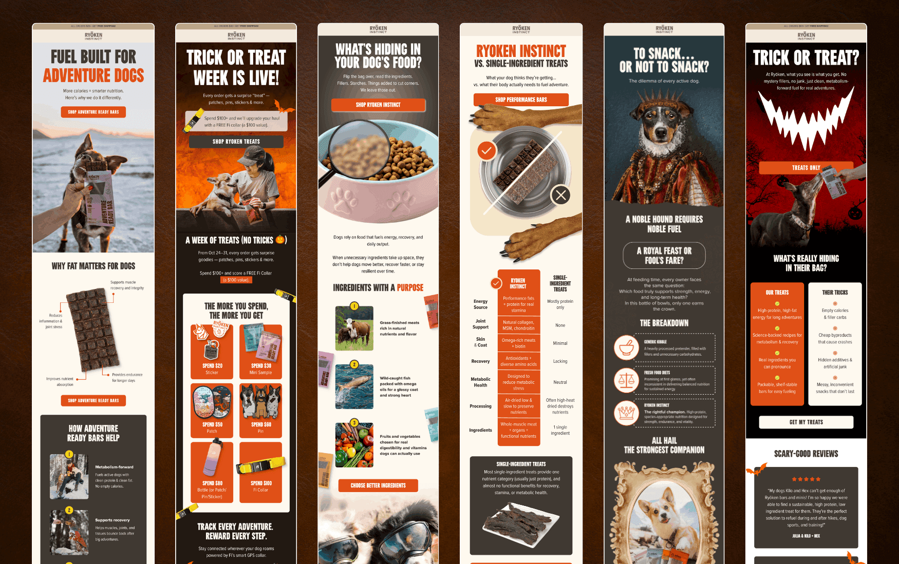
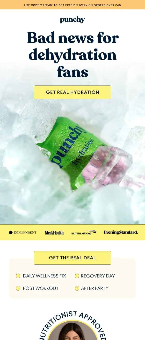
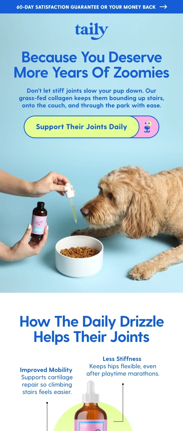
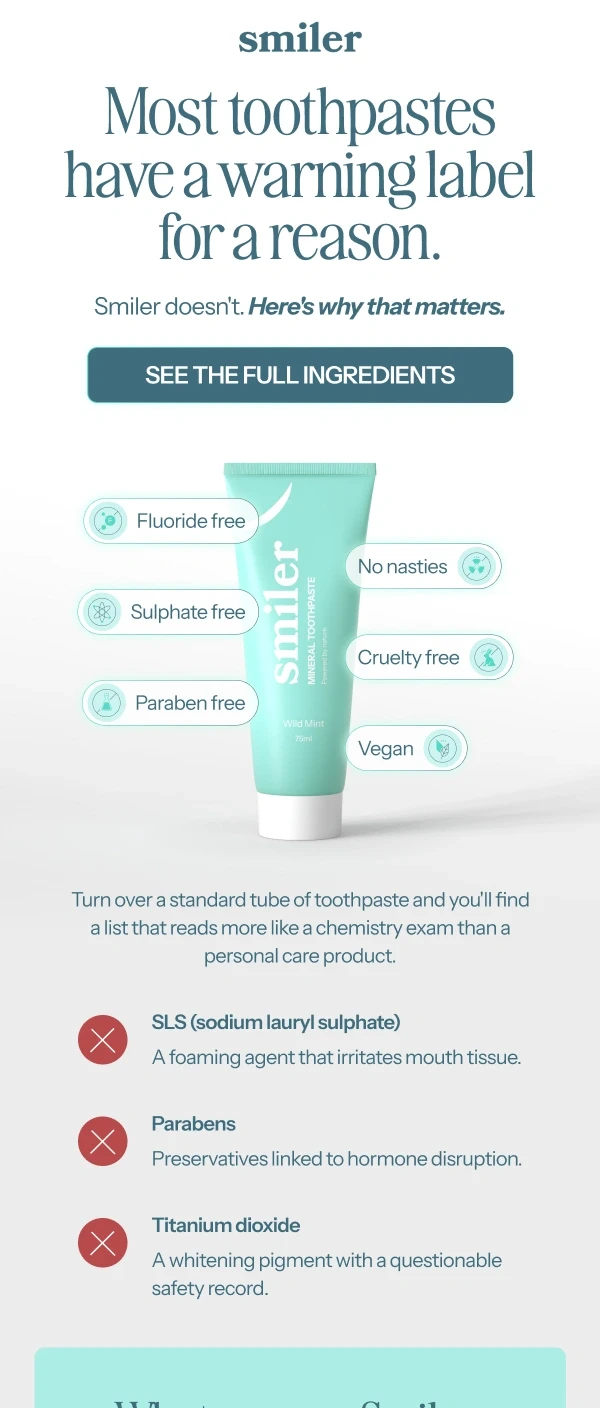
The best-performing emails we've seen across hundreds of brands are almost always the simpler ones. One clear message. One dominant visual. One CTA. Everything else stripped back.
Structure first, design second
Before we touch colour, typography, or imagery, we think about structure. Where does the reader's eye land first? What's the natural scroll path? Where are we placing the CTA — and will it feel earned by the time they reach it?
For the vast majority of ecom emails, the structure that converts best looks like this:
Hero section — logo, headline, subheadline, and the primary CTA button above the fold
Bridge section — one or two lines of supporting context, icons over paragraphs
Product or offer highlight — visual-first, not copy-heavy
Repeated CTA — give readers who scrolled a second chance to click
Footer — clean, minimal, brand-consistent
The CTA above the fold is non-negotiable. On mobile — where the majority of ecom emails are opened — 'above the fold' is a very small amount of screen. Your core message and the button need to be there before the reader has to scroll. If they have to hunt for the button, the design has already failed.
One email. One job.
This is the rule we come back to constantly — and the one that gets broken most often.
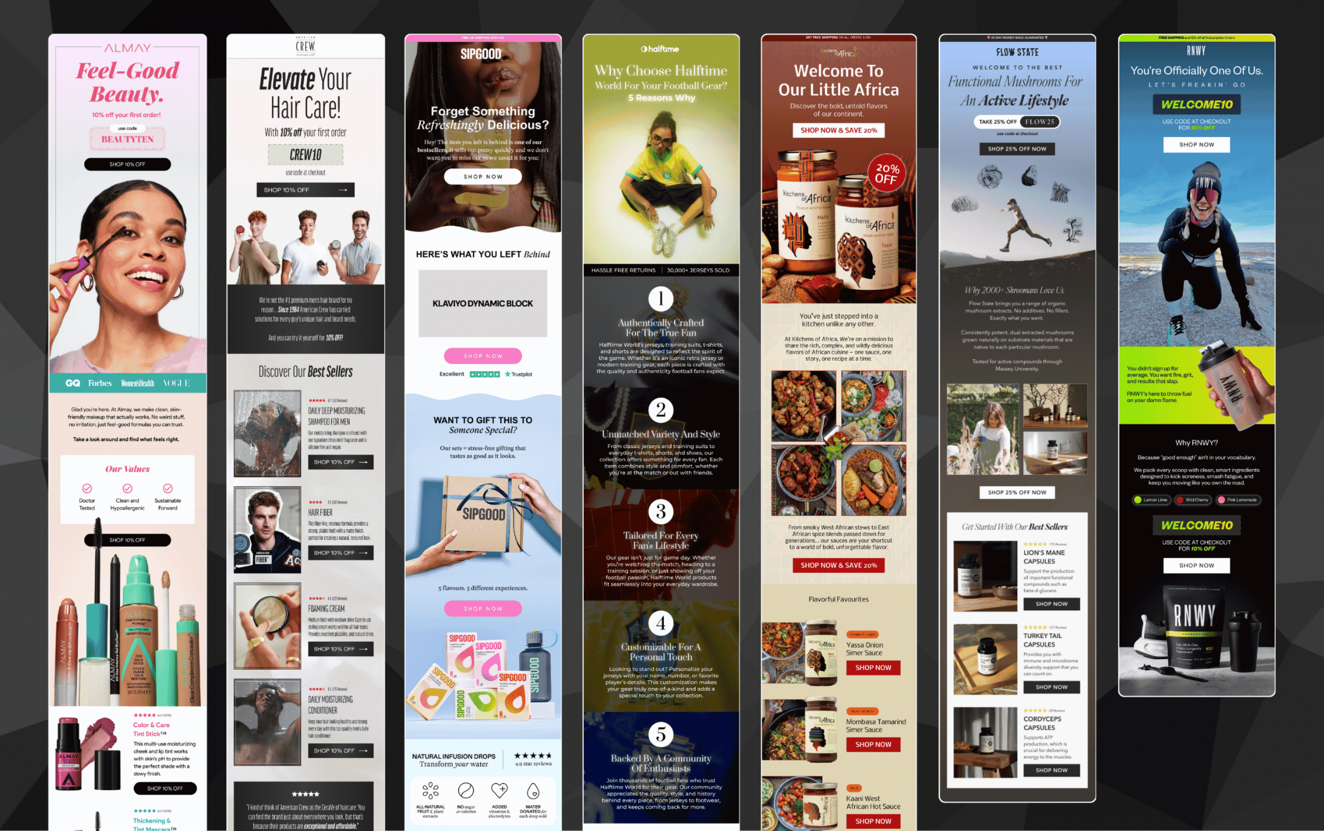
The temptation when briefing an email is to include everything. The new collection and the sale and the brand story and the blog post and the social links. And the result is an email that tries to do five things and achieves none of them.
Every email we design at Marz starts with a single question: what is the one thing we want the reader to do? Everything else in the email either supports that action or gets removed.
Single-focus emails consistently outperform multi-message emails on click rate. Not occasionally. Consistently. The data across our partners backs this up without exception.
Visual hierarchy is what guides the eye
Readers don't read emails — they scan them. Eye-tracking studies consistently show that people spend a fraction of a second determining whether an email is worth their attention before deciding to scroll or close.
Visual hierarchy is what makes that scan work in your favour. It means using size, weight, colour contrast, and spacing to create a clear priority order — so that even someone skimming at pace gets the headline, sees the offer, and finds the button without having to think about it.
In practice this means:
Headlines that are genuinely large — not just slightly bigger than body text
CTA buttons that are impossible to miss — high contrast, minimum 44x44px for mobile tap targets
White space that separates sections cleanly so the eye knows where it is
Product imagery that's the dominant visual — not competing with text for attention
Body copy that's short and broken into lines — never a dense paragraph
If you squint at an email and can't immediately tell what it's asking you to do, the hierarchy isn't working.
What this means for the emails your agency delivers
Every one of these principles applies to every email your clients send. Welcome flow or flash sale. Newsletter or win-back. The fundamentals don't change based on the email type — what changes is how they're applied.
When your design partner understands these principles at a deep level — not just as a checklist but as a design philosophy — the quality of every email goes up. And when email quality goes up consistently, your clients notice. Their results improve. They stay longer. They refer others.
That's why we obsess over the details of ecom email design, not just the production of it.
Liked it? Share it with your people.


Us Vs Them
Launch your creative to new realms — fast, reliable, and scalable
Large agencies spread thin often lack the focus and flexibility to bring your visions to life.
Cover some needs well, but struggle with skill gaps and aren’t easily scalable.
Finding the right freelancer can be awesome, until they reach capacity or you suddenly get ghosted.
More Blogs
Marz Media is a specialized design partner for agencies that need consistent output without capacity issues.

Mar 3, 2026
White Label Email Design: The Complete Guide for Ecom Agencies
Everything ecom email marketing agencies need to know about white label email design — what it is, how it works, and how to find the right partner.
READ MORE

Mar 13, 2026
What Makes a High-Converting Ecom Email Design? And How to Brief One
A practical guide to high-converting ecom email design — covering layout, hierarchy, CTAs, mobile optimisation, and how to write a brief that gets results.
READ MORE
Mar 14, 2026
The Hidden Cost of Unreliable Designers for Your Email Marketing Agency
Missed deadlines and inconsistent quality cost more than you think. Here's the real price your email agency pays for unreliable design.
READ MORE