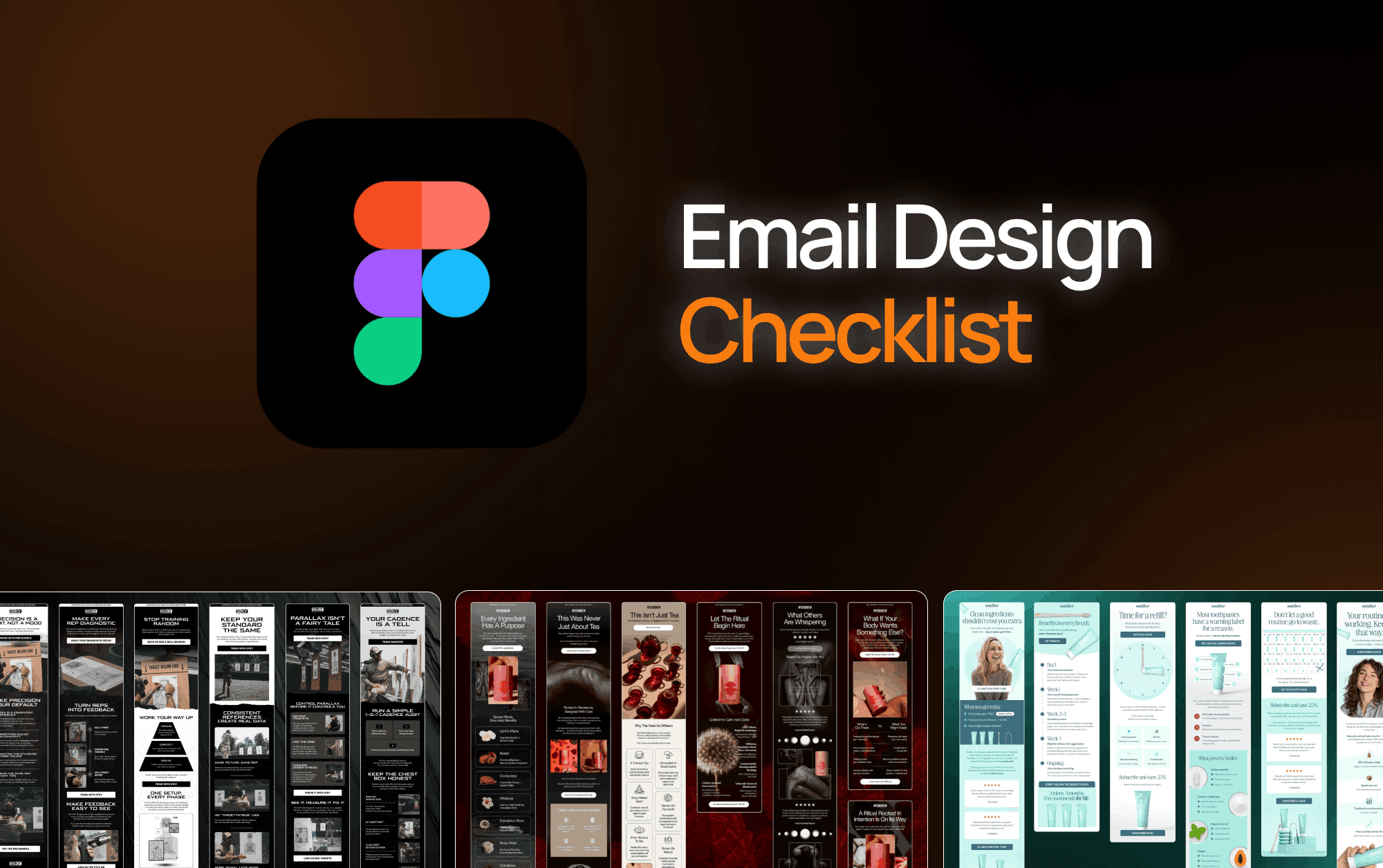
Quality control in email design is where good agencies separate from great ones. It's easy to produce a design that looks right in Figma. It's harder to guarantee that design looks right in every inbox, on every device, with every email client rendering it differently.
At Marz Media, every email we deliver passes a 19-point checklist before it leaves our hands. We're sharing the full list here — not because we want to give away secrets, but because we think every agency should be running something like this, and most aren't.
Before the Design Even Starts
1. Brief is complete and signed off
We don't start designing until the brief has a confirmed goal, audience, key message, copy, assets, and deadline. An incomplete brief produces an incomplete design. Every revision round traces back to something missing at the brief stage.
2. Brand guide reviewed and flagged
Before touching Figma, we review the brand guide and flag anything that's ambiguous or potentially outdated. If the brand has updated colours, fonts, or visual direction since the last email, we want to know before we design to it.
3. Previous emails reviewed
We look at the last 3-5 emails from the brand before designing. This tells us what visual territory has already been covered, what the client has approved before, and where there's room to push.
During Design
These factors will vary depending on your frame size, font selection etc so take these more as a general rule rather than literally.
4. Single primary CTA
Every email has one dominant CTA. If there are secondary links (footer social icons, product grid links), they're visually subordinate and don't compete with the primary action.
5. CTA above the fold on mobile
We check the fold point on a 375px mobile viewport. The headline and at least one CTA button must be visible without scrolling on a standard iPhone screen. If they're not, we restructure the hero.
6. Visual hierarchy passes the squint test
We literally squint at the design. If the primary message and the CTA aren't immediately obvious at a glance, the hierarchy isn't working. We adjust size, weight, or contrast until they are.
7. Font sizes meet minimum thresholds
Body copy: 14px minimum. Headlines: 22px minimum. CTA button text: 16px minimum. These aren't aesthetic preferences — they're legibility requirements on mobile.
8. CTA button meets tap target requirements
Minimum 44x44px tap target. We aim for full-width buttons on mobile wherever the design allows. Small, narrow buttons are one of the most common conversion killers in ecom email.
9. Colour contrast meets accessibility standards
Text on backgrounds passes WCAG AA contrast ratio (4.5:1 for normal text). We use a contrast checker on every text element before delivery. This isn't just accessibility best practice — it also improves legibility across different screen brightness settings.
Before Export
10. White space checked
We review padding and margins between every section. Cramped emails feel cheap and are harder to scan. Generous white space — especially around CTAs — improves both readability and click rate.
11. Brand guide compliance final check
A final pass against the brand guide. Logo usage, colour accuracy (hex codes verified, not eyeballed), font usage, tone of imagery. If anything has drifted during the design process, this is where it's caught.
12. All links mapped
Every clickable element has a destination URL noted. Images, buttons, footer links — all accounted for. Nothing ships without complete link mapping.
13. Alt text written for every image
Alt text for every image — descriptive, keyword-relevant where appropriate. This covers both accessibility and the scenario where images are blocked by the email client, which is common on Outlook and some corporate email setups.
14. Image file sizes checked
Total email file size under 100KB where possible. Large images slow load times, which kills engagement on mobile data connections. We compress every image before export without compromising visible quality.
Rendering & Delivery Checks
15. Tested on iOS Mail
iOS Mail is the most popular email client by volume for ecom audiences. The design is previewed on iOS before delivery. Specifically checking: hero image scale, button rendering, font fallbacks.
16. Tested on Gmail (mobile and desktop)
Gmail strips certain CSS and renders fonts differently. We check both mobile Gmail and desktop Gmail. Common issues: fonts reverting to Arial/sans-serif, padding collapsing, certain background colours not rendering.
17. Tested on Outlook (desktop)
Outlook uses a Word rendering engine that handles HTML email differently from every other client. We check for broken layouts, missing background images, and column stacking issues. Outlook is less common for ecom audiences but some clients require compatibility.
18. Dark mode checked
Dark mode can invert colours and make light-on-dark designs unreadable. We check the email in dark mode and ensure it remains legible. This includes checking that logos with transparent backgrounds haven't become invisible.
19. Plain text version reviewed
Klaviyo sends a plain text version alongside every HTML email. We check this is readable, has the correct links, and doesn't contain broken characters from the HTML export. A broken plain text version can affect deliverability.
Why This Matters for Your Agency
When every email your agency delivers passes a checklist like this, something changes in your client relationships. You stop getting 'this looks broken on my phone' feedback. You stop having to explain why the CTA was cut off above the fold. You stop losing client confidence to avoidable mistakes.
Consistent quality is one of the most powerful retention tools an agency has. A checklist like this is what makes consistency possible at scale — across multiple brands, multiple designers, multiple deadlines.
Feel free to take this list and adapt it for your own agency. Or work with a design partner who already runs it on every email they deliver.
Liked it? Share it with your people.


Us Vs Them
Launch your creative to new realms — fast, reliable, and scalable
Large agencies spread thin often lack the focus and flexibility to bring your visions to life.
Cover some needs well, but struggle with skill gaps and aren’t easily scalable.
Finding the right freelancer can be awesome, until they reach capacity or you suddenly get ghosted.
More Blogs
Marz Media is a specialized design partner for agencies that need consistent output without capacity issues.
Oct 7, 2026
Why Your Welcome Flow Deserves Better Email Design
Design a welcome flow that makes a strong first impression. Learn how better email design can improve brand consistency, guide conversions, and build long-term subscriber engagement.
READ MORE
Oct 7, 2026
Why Do Your Emails Still Miss the Mark If the Brief Was Good?
Discover why clear email design briefs may miss the mark and how aligning strategy, CTA hierarchy, and technical specs leads to stronger first-draft designs.
READ MORE
Mar 3, 2026
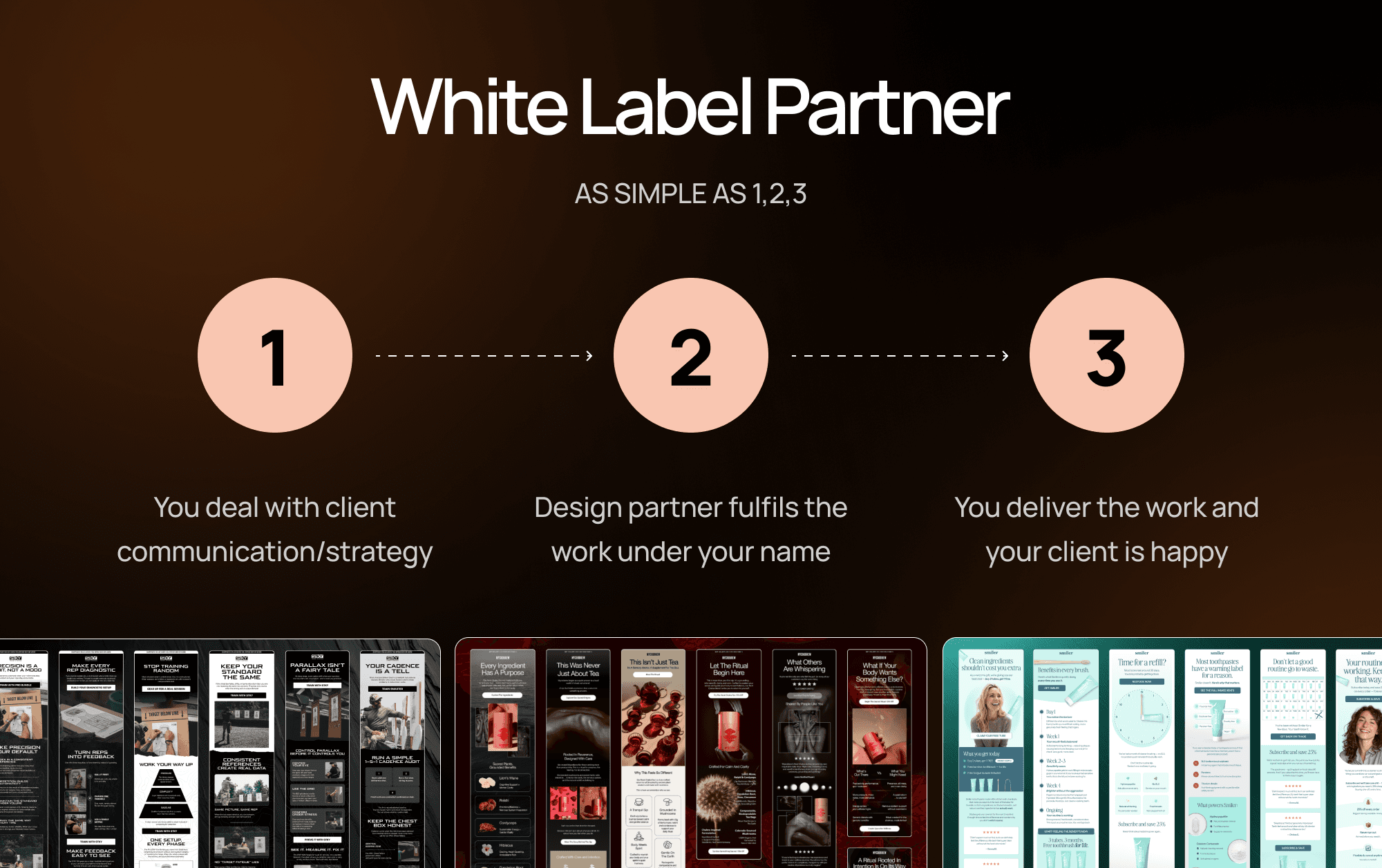
White Label Email Design: The Complete Guide for Ecom Agencies
Everything ecom email marketing agencies need to know about white label email design — what it is, how it works, and how to find the right partner.
READ MORE