In the lifecycle of email marketing, the welcome flow carries a unique burden. It arrives at the exact moment a subscriber's interest is at its peak in just some seconds after they sign up, request a discount, or join a waitlist.
Because open rates for welcome emails routinely double or triple those of standard broadcast campaigns, agencies and e-commerce brands invest heavily in getting the strategy right. They fine-tune the offer, map out the email sequence, and polish the copy.
Yet, many welcome sequences rely on visual layouts that feel like afterthoughts: generic text blocks, static logo headers, and disconnected call-to-action buttons (CTAs) .
A strong offer might secure an initial transaction, but visual execution dictates how a subscriber perceives the brand long-term. Treating welcome emails as basic transactional delivery vehicles wastes the single highest-attention touchpoint in the entire customer lifecycle.
What Is a Welcome Flow, and Why Does It Matter So Much?
A welcome flow is an automated sequence of emails triggered immediately after a user joins an email list. While its operational job is simply delivering a promised incentive, introducing core products, or establishing brand values, its strategic role is foundational.
The welcome sequence sets the baseline expectation for every future interaction. It introduces your visual identity, establishes your content hierarchy, and signals the quality subscribers can expect from your inbox presence.
From a retention perspective, the welcome flow isn't just about driving immediate first-time conversions. It serves as the initial onboarding experience that converts casual browsers into active brand advocates.
What Makes a Welcome Flow Different From Other Email Flows?
Unlike abandoned cart triggers, win-back flows, or post-purchase post-mortems, the welcome flow operates in a distinct context:
Unmatched Attention and Intent: Subscribers actively check their inbox immediately after opting in. Expectation is high, meaning visual friction or poor layout choices are noticed instantly.
Blank-Slate Customer Perception: The subscriber may know very little about your product catalog, brand narrative, or value proposition. The visual layout must organize unfamiliar information effortlessly.
Higher Technical Expectations: Because subscribers often open these emails on mobile devices seconds after signing up on a mobile site, seamless responsive design and fast image loading are critical.
While behavioral triggers react to specific drop-offs, the welcome flow establishes the strategic frame for the entire relationship.
What Actually Affects the Performance of a Welcome Flow?
A welcome flow’s success depends on three interconnected elements working in harmony: timing, message clarity, and visual presentation.
A high-converting welcome sequence relies on a clear performance foundation:
Immediate Delivery: Technical latency kills momentum. The first email must land within seconds of sign-up.
Frictionless Incentive Redirection: If a welcome offer is promised, the primary call to action must make claiming that offer effortless.
Scannable Information Architecture: Readers scan before they read. Visual weight must guide the eye naturally from the main promise to supporting details.
Scannable Information Architecture: Readers scan before they read. Visual weight and hierarchy must guide the eye naturally from the main promise to supporting details.
Brand Recognition: Consistent use of typography, color palette, and visual assets reassures subscribers they are in the right place.
When strategy, copy, and layout align, the welcome sequence transitions seamlessly from an immediate promotional push into a long-term engagement engine.
Why Does Design Matters More in Your Welcome Flow Email?
Strategic copy tells subscribers why your brand matters, but email design shows them how your brand operates.
In a crowded inbox, visual presentation creates the immediate emotional reaction that determines whether a subscriber reads further or hits delete.
Setting the Aesthetic Benchmark
Your welcome flow is your brand's digital front door. A cluttered layout, poorly scaled hero image, or unformatted text block creates cognitive friction, making the brand feel unpolished. Thoughtful spatial padding, intentional typography, and cohesive visual hierarchy communicate professionalism instantly.
Navigating Unfamiliar Product Offerings
When subscribers join your list, they rarely understand your full product lineup. Good email design uses structured grids, visual category blocks, and intuitive spacing to break complex catalog choices into digestible, scannable choices.
Guiding Eye Movement to the Call to Action
Conversion relies on visual momentum. Strategic use of contrast, whitespace, and directional visual cues ensures the subscriber’s eye moves naturally toward the primary action without feeling overwhelmed by competing buttons or secondary banners.
How to Design a Welcome Flow That Builds the Brand From the First Email
Designing an impactful welcome series requires a balance between conversion psychology and brand storytelling. Rather than attempting to pack every detail into Email 1, structure the visual experience across a progressive narrative sequence.
Email 1: Immediate Gratification & Core Identity Focus heavily on delivering the promised offer with zero visual noise. Use a high-contrast hero section, clear headline typography, and a prominent primary CTA button. Keep secondary links minimal to prevent distraction from the main conversion goal.
Email 2: Storytelling & Value Differentiation Shift the visual focus toward brand identity and product education. Utilize split-screen layouts, editorial imagery, or founder quotes supported by clean body typography to explain what sets your products apart.
Email 3: Social Proof & Product Curation Introduce subscriber validation through structured social proof blocks. Use star-rating icons, user-generated content grids, or curated customer review modules to reduce purchase hesitation.
Email 4: Overcoming Friction & Expanding the Catalog Highlight secondary value propositions such as free shipping, guarantee policies, or popular category roundups using modular layout blocks that encourage exploration.
Should Your Welcome Emails All Look the Same?
Maintaining visual consistency across a welcome series does not mean repeating the exact same layout four times in a row.
A well-crafted sequence utilizes a shared visual framework matching font pairings, button styling, and spatial grids while varying layout structures to suit each email's specific purpose.
Structural Continuity: Use consistent header styles, footer modules, and logo placements so subscribers recognize your emails instantly.
Functional Variation: Adapt the interior layout to match the goal. Email 1 might feature a single-column, offer-focused layout, while Email 2 uses a rich editorial structure, and Email 3 relies on a multi-card product grid.
Varying the component layout while holding the core brand styling steady keeps the series visually engaging without fragmenting brand recognition.
When Can a Welcome Flow Become a Retention Flow?
A welcome flow should not be treated as a short-lived promotional tool that ends once a discount code expires. When designed thoughtfully, it functions as the first phase of your long-term customer retention strategy.
By introducing subscribers to your brand values, community aspects, and core product benefits early on, the welcome series lays the groundwork for ongoing engagement.
To transition a welcome sequence into a retention engine:
Introduce Educational Content Early: Dedicate visual space to usage guides, care tips, or lifestyle content that helps subscribers get maximum value from your product category.
Highlight Community & Social Channels: Incorporate dedicated social proof or community modules that invite subscribers to engage beyond the inbox.
Gather Subscriber Preferences: Use visual preference centers or interactive survey blocks to let subscribers select their interests, enabling hyper-personalized follow-up flows down the line.
How to Reuse Your Welcome Flow Without Repeating the Same Message
Creating high-performing email flows requires significant strategic effort. Rather than reinventing your onboarding experience for every segment, agencies can build modular design systems that allow welcome assets to be repurposed intelligently.
Adapted by Sign-Up Source: Swap out the primary hero graphic and intro messaging based on where the subscriber opted in (e.g., a specific landing page vs. an exit-intent pop-up) while keeping the secondary brand modules identical.
Repurpose Modules in Browse Abandonment: Use successful product curation blocks or brand value modules from your welcome series within behavioral browse triggers to reinforce key messaging.
Update Seasonal Accents: Retain your master welcome architecture while swapping global color accents, promotional banners, or lifestyle photography to reflect seasonal campaigns.
This modular approach ensures messaging remains fresh across subscriber touchpoints while protecting design bandwidth.
Signs To Know When It Is Time to Redesign Your Welcome Flow
Even strong welcome flows require periodic review to remain effective. Agency teams should audit and refresh welcome designs when key performance metrics or operational factors shift:
Declining Engagement Metrics: A steady drop in click-to-open rates often signals that your visual layout or message hierarchy is losing effectiveness against evolving subscriber expectations.
Rebranding or Catalog Expansion: If your brand updates its visual guidelines, website layout, or primary product focus, the welcome series must be updated immediately to maintain a seamless transition from site to inbox.
Increased Mobile Drop-Offs: If mobile click rates lag significantly behind desktop performance, it indicates that font scaling, touch-target CTA sizing, or image loading speeds require technical optimization.
Outdated Product Assets: Relying on legacy product photography or outdated promotional messaging undermines subscriber trust right at the start of the relationship.
Give Your Welcome Flow the Design It Deserves
A welcome flow is often the first real experience a subscriber has with a brand. It should feel intentional from the first email; not like a template assembled at the last minute.
Marz works as an extension of your agency’s team, handling the email design production behind the campaigns you build. From welcome flows and lifecycle campaigns to modular design systems, we help agencies deliver polished, on-brand emails without adding more design work to their internal workload.
Have a welcome flow that deserves better design? Let’s talk.
Liked it? Share it with your people.


Us Vs Them
Launch your creative to new realms — fast, reliable, and scalable
Large agencies spread thin often lack the focus and flexibility to bring your visions to life.
Cover some needs well, but struggle with skill gaps and aren’t easily scalable.
Finding the right freelancer can be awesome, until they reach capacity or you suddenly get ghosted.
More Blogs
Marz Media is a specialized design partner for agencies that need consistent output without capacity issues.
Mar 3, 2026
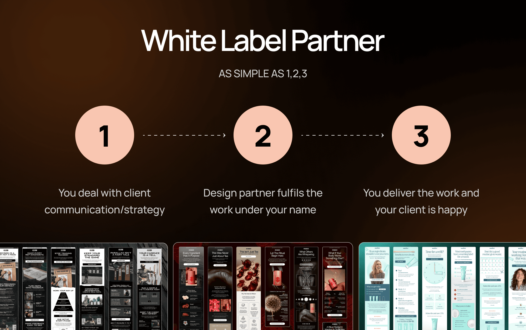
White Label Email Design: The Complete Guide for Ecom Agencies
Everything ecom email marketing agencies need to know about white label email design — what it is, how it works, and how to find the right partner.
READ MORE
Mar 13, 2026
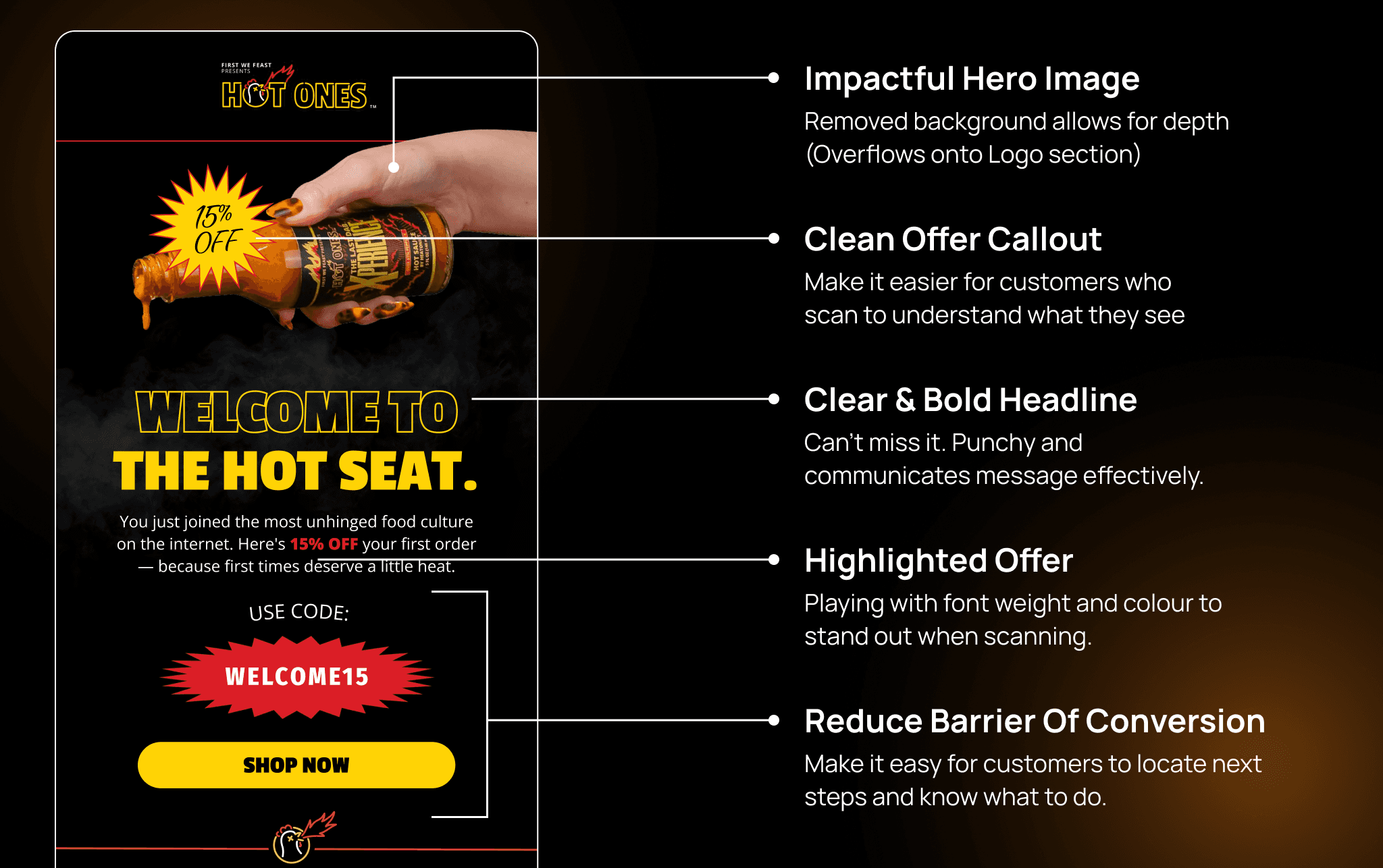
What Makes a High-Converting Ecom Email Design? And How to Brief One
A practical guide to high-converting ecom email design — covering layout, hierarchy, CTAs, mobile optimisation, and how to write a brief that gets results.
READ MORE
Mar 14, 2026
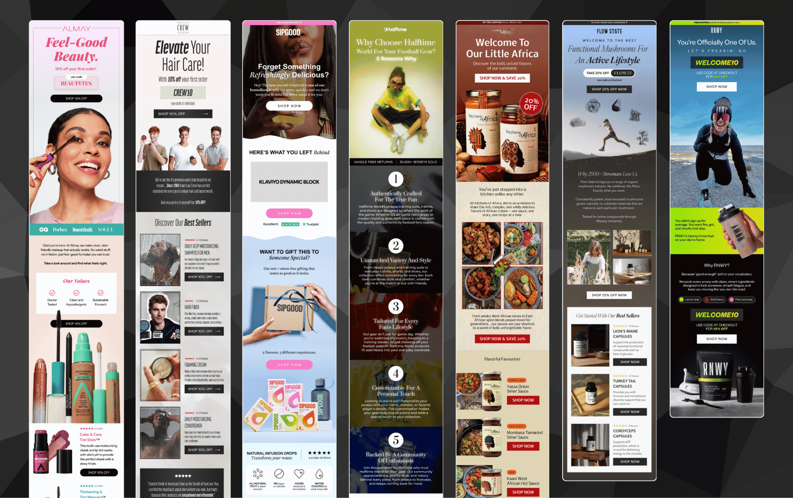
The Hidden Cost of Unreliable Designers for Your Email Marketing Agency
Missed deadlines and inconsistent quality cost more than you think. Here's the real price your email agency pays for unreliable design.
READ MORE