Black Friday email design for an agency isn't one creative problem. It's eight or ten of them, running in parallel, against the same deadline. The agencies that get through BFCM calmly do three things: they lock every client's campaign structure by mid-October, design one "anchor" email per brand that sets the visual system for the whole series, and protect design capacity for the last-minute changes that always come. Black Friday 2026 falls on 27 November, so the clock is already running. Here's the timeline, series structure, design rules and capacity maths to plan around.
When should agencies start designing Black Friday emails?
Work backwards from the send dates, not forwards from "when we get to it". For BFCM 2026 (Black Friday on 27 November, Cyber Monday on 30 November), the schedule looks like this:
Fri 16 Oct (6 weeks out): Offer, dates, segments and number of emails per client. Every design decision depends on the offer. Late offer changes cause more BFCM rework than anything else.
Fri 30 Oct (4 weeks out): One anchor email designed and approved per client. It sets the visual system for the entire series.
Fri 6 Nov (3 weeks out): Full series designed as variations of the anchor. Variations are fast once the system exists.
Fri 13 Nov (2 weeks out): Everything built in Klaviyo, tested and link-mapped. Leaves a full week for client feedback and QA.
Fri 20 Nov (1 week out): Final QA, send schedule and suppression lists. After this point, fixes only. No new creative.
23–30 Nov: Campaign week. Keep same-day design capacity for extensions, sell-outs and "can we run it one more day?"
Starting late? If it's mid-October and nothing is locked, compress rather than skip: lock offers this week, get anchors approved within seven days, and design each client's series in one batch instead of email by email. If you're taking on a brand-new client for BFCM, a fast onboarding process matters more than ever. Here's how to onboard a new email marketing client in 24 hours.
How many emails should a Black Friday campaign have?
A typical BFCM campaign for an ecom brand runs seven to ten emails across roughly ten days. Smaller lists can do it in five; larger, well-segmented brands often send more. The structure matters more than the count:
1. Early access (5–7 days before, for VIPs and engaged subscribers): Exclusive and brand-forward: a reward, not a shout.
2. Announcement (2–3 days before, for the full engaged list): The anchor. The most designed email of the series: offer and start date front and centre.
3. Sale is live (Black Friday morning, for the full list): Offer as the headline, CTA above the fold, countdown timer.
4. Reminder (Black Friday evening, for non-clickers): Shorter and sharper, same visual system.
5. Weekend angle (Saturday–Sunday, for engaged non-buyers): A new reason to click: bestsellers, bundles or a gift guide.
6. Cyber Monday (Monday morning, for the full list): A fresh hook that looks visibly different from Friday.
7. Last chance (Monday evening, for non-buyers): Almost copy-only. The deadline is the headline.
Don't forget the flows. If the welcome flow still promises 10% off while the site shows 30%, new subscribers get a worse deal than everyone else. Agree with each client which automations get a BFCM version and which get paused, and design those alongside the campaign, not after it.
Design one anchor email, then build the series from it
The biggest time-saver in BFCM design is refusing to design each email from scratch. Design the announcement email first and treat it as the campaign's visual system: colour palette, type scale, offer treatment, button style and the set of modules (hero, offer block, product tiles, countdown, footer). Every other email in the series reuses that system at a different intensity.
The rule of thumb: polish early, urgency late. Early access and announcement emails are brand-forward and considered. By the reminder and last-chance sends, the design strips back until it's little more than the offer, the deadline and a button. If you need a refresher on what each block of a high-performing email should do, see the anatomy of a high-converting ecom email.
Design rules that hold up in a BFCM inbox
Lead with the offer, not the brand. "Up to 40% off everything" beats "The [Brand] Black Friday Event" as a headline every time. Put it in live text so it's readable in the preview pane.
Keep important text out of images. Live text survives image blocking, dark mode and screen readers. Text baked into a JPG doesn't.
Design for dark mode deliberately. Dark backgrounds are popular for BFCM because they stand out in a white inbox, but test them: transparent logos disappear, and inverted colours can wreck contrast.
Mobile first, always. Our baseline specs: a 600px max-width container, body copy no smaller than 14px, tap targets at least 44px tall, and the headline plus one CTA visible without scrolling on a 375px-wide screen.
Use countdown timers, and design frame one. Live timers are animated GIFs. Classic desktop Outlook only shows the first frame, so make sure that frame still reads well on its own.
Watch the email weight. Gmail clips messages whose HTML goes over roughly 102KB, which can hide the footer and unsubscribe link. Huge product grids are the usual culprit.
The capacity maths most agencies skip
Before you promise every client a nine-email BFCM series, do this sum:
Design jobs = (clients × campaign emails + clients × flow updates) × revision buffer
Use a revision buffer of at least 1.5 for BFCM. Offers change, products sell out, and clients want "one more version" more often in November than at any other time of year.
Worked example: an agency with 8 ecom clients, each getting 8 campaign emails and 2 flow updates, needs (64 + 16) × 1.5 = 120 design jobs in about four weeks. That's around 30 a week, on top of normal retainer work.
Now compare that number with what your team can genuinely deliver per week at BFCM quality. If it doesn't fit, decide now, not on 20 November. You can narrow the series for smaller clients, get anchors approved earlier, or line up extra design capacity before every agency starts competing for the same freelancers. If you're weighing those options, here's an honest comparison of freelancers vs a design agency vs an in-house designer.
An approval workflow that prevents BFCM disasters
One offer document per client. Offer, dates, discount codes, exclusions, segments, with a change log. Designers work from the document, never from a Slack message.
Three sign-off gates. Offer lock, anchor approval, final send approval. Put the dates in the client's calendar at kick-off.
Review the series as a series. Send clients the whole sequence laid out in order. They approve a system instead of nitpicking emails one by one, and inconsistencies jump out.
QA every email before the client sees it. Links, alt text, dark mode, mobile, plain-text version. We run a 19-point email design checklist before every delivery; BFCM is when it earns its keep.
One named owner per send. When three people can press send in Klaviyo, someone eventually sends the wrong version to the wrong segment.
Getting approved designs into Klaviyo quickly also matters in campaign week. This walkthrough on getting Figma designs live in Klaviyo fast is worth a look.
The BFCM design mistakes we see most often
Designing every email independently. The series looks disjointed and you burn hours you don't have.
Burying the offer under a lifestyle hero image.
Image-only emails that break in dark mode and say nothing when images are off.
Forgetting the flows, so the welcome series undercuts the Black Friday offer.
Accepting offer changes after the lock date without moving the deadlines with them.
Relying on a freelancer who disappears in November. It happens every year. Here's what unreliable design really costs an email agency.
Leaving zero capacity for campaign week, when same-day changes are guaranteed.
If design capacity is your bottleneck this BFCM
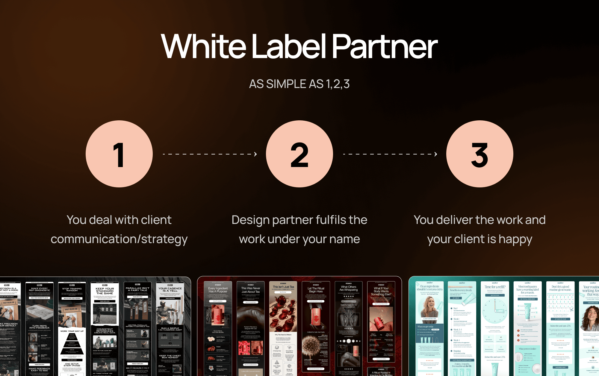
Peak season is when most agencies discover their design ceiling. Marz is a white-label design partner built for exactly this: a dedicated Slack channel, briefs submitted through our app, first drafts within 72 hours of a complete brief, same-day revisions, and everything delivered in Figma under your agency's name. Hamilton Emails brought us in to support their Black Friday campaigns across clients in five-plus industries.
If you're planning BFCM now, see how white-label email design for agencies works and book a call. The sooner anchors are approved, the calmer November gets.
Black Friday email design FAQ
How many emails should you send for Black Friday?
Most ecom brands send seven to ten emails across the BFCM window: early access, announcement, launch, reminder, a weekend angle, Cyber Monday and a last chance. Smaller lists can run a tighter five-email version. Use segmentation so buyers drop out and non-clickers get the reminders.
When should Black Friday emails start?
Early-access emails usually go out five to seven days before Black Friday and the announcement two to three days before. Design work should start about six weeks out, with offers locked first.
Should Black Friday emails have a dark background?
Not necessarily. Dark designs stand out in a crowded inbox, which is why they're common, but contrast, a readable offer and a clear CTA matter more than the background colour. Whatever you choose, test it in dark mode.
Do countdown timers work in email?
Yes, in most email clients. Live timers are generated as animated GIFs by a timer service. Classic desktop Outlook only shows the first frame, so design that frame to make sense on its own.
What's the best layout for a Black Friday email?
An offer-led headline, one supporting line and a CTA above the fold, followed by hero products or category tiles and a second CTA lower down. Keep one primary action per email.
Liked it? Share it with your people.


Us Vs Them
Launch your creative to new realms — fast, reliable, and scalable
Large agencies spread thin often lack the focus and flexibility to bring your visions to life.
Cover some needs well, but struggle with skill gaps and aren’t easily scalable.
Finding the right freelancer can be awesome, until they reach capacity or you suddenly get ghosted.
More Blogs
Marz Media is a specialized design partner for agencies that need consistent output without capacity issues.

Oct 7, 2026
Why Your Welcome Flow Deserves Better Email Design
Design a welcome flow that makes a strong first impression. Learn how better email design can improve brand consistency, guide conversions, and build long-term subscriber engagement.
READ MORE

Oct 7, 2026
Why Do Your Emails Still Miss the Mark If the Brief Was Good?
Discover why clear email design briefs may miss the mark and how aligning strategy, CTA hierarchy, and technical specs leads to stronger first-draft designs.
READ MORE
Mar 3, 2026
White Label Email Design: The Complete Guide for Ecom Agencies
Everything ecom email marketing agencies need to know about white label email design — what it is, how it works, and how to find the right partner.
READ MORE